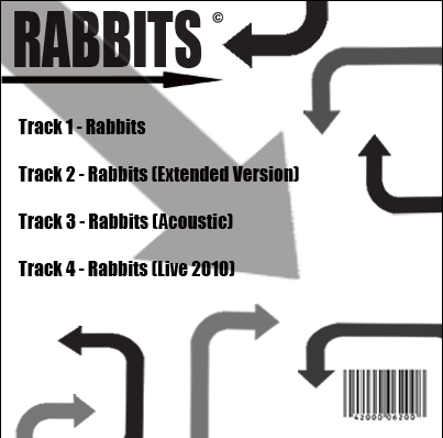
This is the back cover of the album artwork created for Weak(end) Arrows single 'Rabbits'
The colour scheme makes it look very sophisticated and iconic classic album. The font is very traditional and again is very iconic. The colour scheme of black and white is very eye catching and stands out, which is a key concept for marketing the album cover. The barcode in the bottom right corner is a conventions of album artwork and is a standard image which appears on every album cover. The random arrows link to the name of band and symbolise direction and motion. The arrow underlining the title flows with the way the viewer reads the text and again symbolises direction. Having the different colour arrows (Grey, Black) again is code for tradition and old fashion.
No comments:
Post a Comment